Dear Mr. Cappelletti,
I am a student at Sacramento New Technology High School. I have been taking illustrator as a college class this semester. I have enjoyed taking this class. I learned how to use both photoshop and illustrator. I know what the difference between the two is and how they work differently. I feel that I have improved because at the beginning I knew how to use photoshop a little and now I know how to use both photoshop and illustrator. I feel that my work looks better than when I first started the class. Below are the projects I have completed while taking this class with the help of Mr.Harris.
I am a student at Sacramento New Technology High School. I have been taking illustrator as a college class this semester. I have enjoyed taking this class. I learned how to use both photoshop and illustrator. I know what the difference between the two is and how they work differently. I feel that I have improved because at the beginning I knew how to use photoshop a little and now I know how to use both photoshop and illustrator. I feel that my work looks better than when I first started the class. Below are the projects I have completed while taking this class with the help of Mr.Harris.
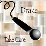
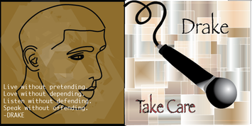
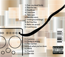
CD Cover
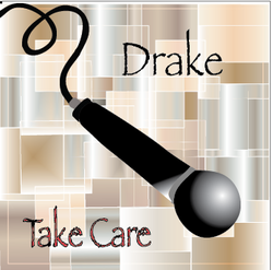
For this project I had to make a cd cover. The tools that I feel comfortable using was using the pencil tool and the pen tool because they were easy to use. They were easy to use because I used them to trace. I didn't really face any obstacles because I kind of knew how to use the tools and how they worked. I didn't learn new vocabulary because I had already heard the words before. The best part of this project was when the cd started to look the way I wanted it to. The hardest part of the project was making a background that went with the cd. Something that I learned that I didn't know was how to use the pencil tool. The most valuable thing that I learned during this project was using the pencil tool. It was the most valuable thing I learned because it makes it easier to trace something and make it look the way that you want it to look.
Shadow Project
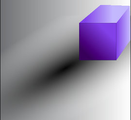
For this project I had to draw an object with a shadow and then do it on illustrator. The object that I choose to do was a cube. This project was challenging because it was hard to do the shadow. The tool that I mainly used was the pen tool. I used the pen tool to trace the cube that I drew. The hardest part of this project was making the shadow and making it look right. An obstacle that I faced was making the shadow.
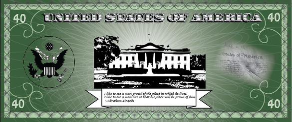
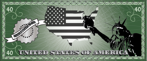
Dollar Bill
For this project I had to crate a new design for a dollar for the United States. We had to use symbols that represent the United States. We had to use 2-6 symbols. We also needed to include a quote in english and a quote in latin. An obstacle that I faced during this project was was making the images kind of fade so that their was not any harsh edges. The most valuable thing I learned was learning about flare It was valuable because it helped me fade the images so that their was not any harsh edges or lines and so that it kind of blended in better. The best part of the project was designing your own dollar bill. The hardest part of the project was making sure that the images went good together.
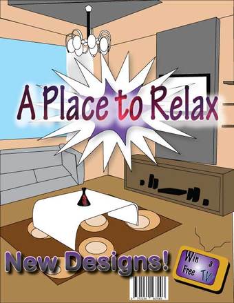
Interior Design
For this project I had to make a magazine cover for an interior design. I did a magazine cover on a living room magazine. I created this design using illustrator. Their is many things in the living room that I made like a sofa, tv, a window with curtains, speakers, a table and many more things. An obstacle that I had during this project was making the couch because it was hard to make it and it was hard to make it look realistic. It was also difficult to put shadow on my design. I learned how to do different type of text designs. The best part of this project was making the living room look however I wanted and putting in my own colors.
Anti Smoking Poster Project
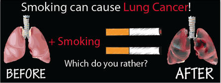
For this project I had to make an anti smoking advertisement to put on billboards. I made mine about how smoking can cause lung cancer. I had two lungs one that were healthy and the other ones that were damaged from smoking. And I put "which one would you rather?" to show that the healthy lungs are better so people should not smoke. A challenge for this project was making the cigarette because it was challenging for me to make them look good and making the two lungs look realistic was also challenging. Also it had to be ten words or less and mine was over ten words. I tried to make words stand out by changing the color of them to red. I made the two cigarettes be the equal sign.
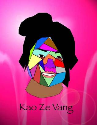
Water Color Portrait
For this project we had to make a portrait of someone using water colors. The challenging part of this project was making the colors show because the colors turned out lighter than the color that I picked. Making her hair was also a challenging part because her hair was in a bun and was hard to trace it and make it look right. I like how the hair came out because it actually looked like a bun and how she had it in the picture. I also like the background.
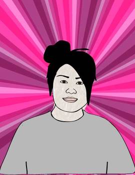
Gray Scale Portrait
For this project we had to make someones portrait uning only gray colors. I used different shades of gray so that the portrait was more detailed. The lighter parts I would make a light gray and the darker parts I made a darker shade of gray. I also added a background with different angles and colors. The challenge I had with this project was that only gray colors were suppose to be used to make the portrait so it was a little difficult to make it detailed and look like the person.
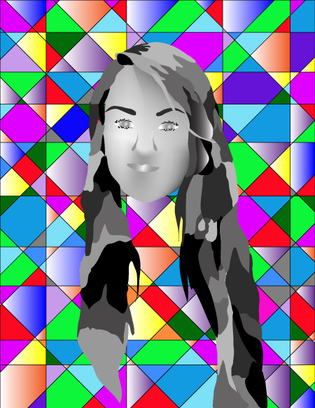
Angle Portrait
For this project I had to make a portrait of some one else. We had to make the portrait using only angles. The challenging part of this project was making the face look like the person because we could not use any curved lines.